In advertising, one agency’s homage can be another’s appropriation. Call it parody, plagiarism or pastiche, ‘repurposing’ a successful design for new ends has been with us since pictorial posters were first pasted onto the hoardings. In the process, the origin and meaning of a particular design can be lost as the new version comes to signify something quite different from that initially intended. It’s a process that divides professional opinion, lauded as witty reinterpretation or condemned as fraudulent copying in equal measure . Whatever the motivation might be, parodying printed posters has a long tradition and shows no sign of diminishing in the digital age.
Here are ten examples of influential designs that have proved especially tempting for reinvention.
1. Berlin Industrial Fair, Germany, 1896


Not a well-known image today, Ludwig Suetterlin’s sober design for the Berlin Industrial Fair (left) prompted one of the first well-documented examples of poster appropriation when it was parodied by Edmund Edel (1863-1934) for his poster advertising the city’s Wintergarden theatre (right). Already the darling of the poster world, Edel’s version was generally regarded as a clever reworking of an original idea, rather than plagiarism.
2. Skegness is SO Bracing, Great Britain, 1908

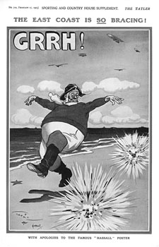
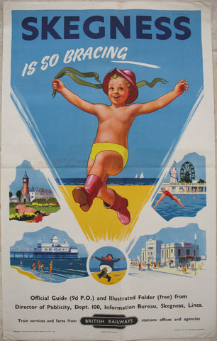
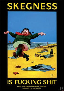
Three versions of Hassall's original design: Tatler 1914, BR 1950s, Viz 1995
3. Your Country Needs YOU! Great Britain, 1914
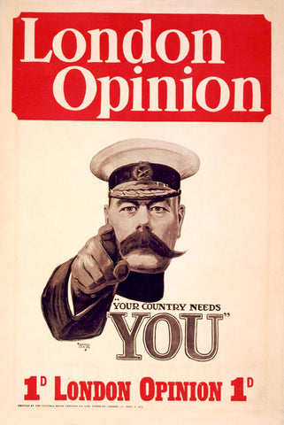
Originally designed by Alfred Leete (1882-1933) as a cover illustration for the weekly London Opinion magazine, this army recruiting poster is now so well known that it has passed into the visual language of the First World War. But it was not always the case. In fact, there is considerable doubt whether Leete’s unsettling image of Secretary of State for War, Lord Kitchener, was much distributed as a poster at all during the war (for a full summary of the debate, read James Taylor’s excellent book Your Country Needs You: The Secret History of the Propaganda Poster, 2013). It was, however, hugely influential and inspired the artist Montgomery Flagg (1877-1960) to produce a version featuring ‘Uncle Sam’ for the American market in 1917. With over 4 Million copies printed, Flagg’s version is now probably the more famous of the two, certainly in the States where it is sometimes positioned as the originator of a style much copied by others. And it certainly has been extensively reworked, whether by communist regimes seeking to impose order, as an anti-establishment motif of 60’s counter culture, or as a jokey device to increase membership (what club or society, it would seem, doesn’t Need YOU?). Sadly, the belated popularity was of little benefit to Leete himself, who died forgotten.

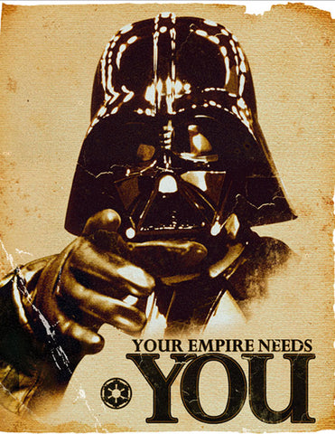
Montgomery Flagg version (1917) and Star Wars parody (c.2010)
4. Books! Russia, 1924
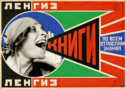
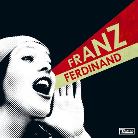
It’s hardly surprising that one of the greatest posters of the Soviet era and, indeed, the twentieth century should lend itself to imitation. Designed by Alexander Rodchenko (1891-1956) for the Gosizdat publishing house, the original poster featured the actress Lilya Brik shouting out the word "books" to a post-revolutionary Russian world. Like all imitated designs, the powerful simplicity of the composition is especially susceptible to appropriation by changing a key word or image. Its influence can be seen today in products as diverse as the packaging for American Bazooka bubble gum and the cover artwork for the Franz Ferdinand album You Could Have Said It So Much Better (2005, below).
5. I’m Taking an Early Holiday ‘cos I know Summer Comes Soonest in South, Great Britain, 1925
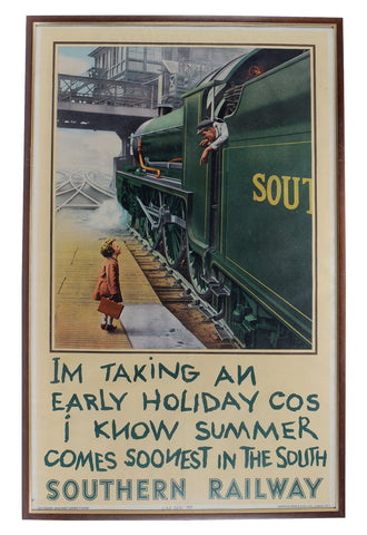
Most poster parodies rely on an assumed knowledge of design history among audiences (whether real or imagined), as can be seen with this Southern Railway publicity poster and it’s not very contemporary imitators. The first version, which was later reissued in colour, featured a black and white photograph of a boy carrying a suitcase on the platform at London’s Waterloo station. Railway enthusiasts will be pleased to note that he is talking to the fireman of King Arthur class locomotive No.755 The Red Knight. A mere seven years later, the rival publicity team at the London & North Eastern Railway spoofed the rather quaint vignette with an aggressively modern version of their own, advising a stylised young boy to travel on the Flying Scotsman. Not wanting to miss out on the topicality of the campaign, British Rail entered the fray in 1978 with a reworking of the original Southern poster, but this time showcasing a new-ish InterCity 125 diesel train. The first version is now regarded as a ‘poster classic’, and a favourite of the nostalgia souvenir trade.
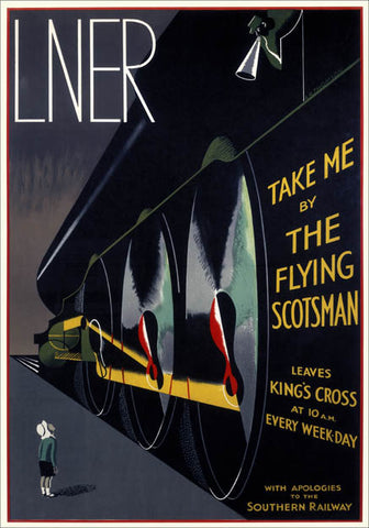

LNER and BR versions (1932 and 1978)
6. Normandie, France, 1935
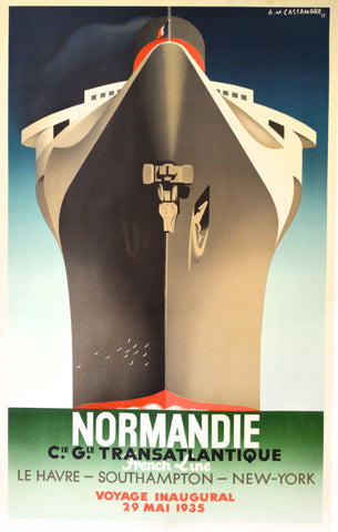
The first of two cheat entries on the list (see also ‘Legs’). Nobody is suggesting that the brilliant French posterist A.M Cassandre (1901-1968) invented the transatlantic shipping poster, but rather that he was its greatest exponent. His Normandie masterpiece is included here as representative of a style of poster that was endlessly churned out during the heyday of the great ocean going passenger liners. And there is the rub: some types of poster advertising have relatively few options for literal depiction. In the case of a ship you can go for the front, side or rear view. And if you’re going for the front view, you may as well make the central image as domineering, glamorous, modern and safe looking as possible. In other words, not all similar posters are parodies of other designs. Of course, a great designer will always look for a new solution to a familiar marketing problem, and it’s only fair to note that Cassandre’s output included several less conventional takes on the joys of an ocean voyage.
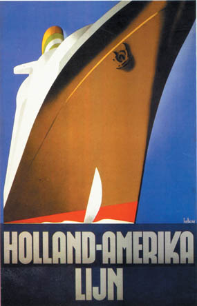

Shipping posters, 1931 and 1936
7. Keep Calm and Carry On, Great Britain, 1939
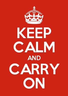
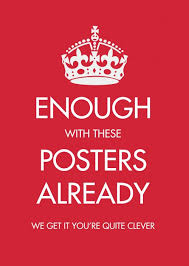
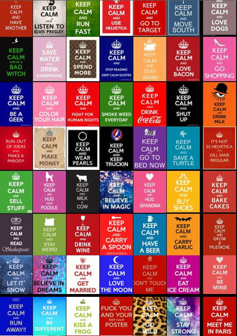
Surely THE retro-poster phenomenon of the twenty first century, Keep Calm and Carry On must be one of the most parodied designs in British history. The original poster was printed in 1939 in readiness for the mass German air raids which the government believed would devastate cities and civilian morale. In the end it was never used, mainly because similar posters exhorting the public how to behave had not gone down well. Once the immediate danger had passed nearly all 2.5 million copies were pulped in a salvage drive, but inevitably a few survived. One of these was rediscovered in a book shop in Alnwick, Northumberland, in 2000 and reprinted as a somewhat ironic and inspiring link between the perceived values of wartime stoicism and modern day crisis. In the process, the poster’s original meaning was transformed and quickly lost altogether as new versions replaced the phrase ‘Carry On’ with endless humorous alternatives. These in turn have been applied to a bewildering range of products, including posters, cups, cushions, badges, baby grows, t-shirts, keyrings, tote bags, lipstick, aprons, party balloons, deck chairs, phone cases, greetings cards, fridge magnets etc. If you’d like to find out more, visit Dr Bex Lewis’ dedicated webpage (http://drbexl.co.uk) or read Susannah Walker’s excellent summary, Home Front Posters of the Second World War, 2012.
8. We Can Do It! USA, 1943
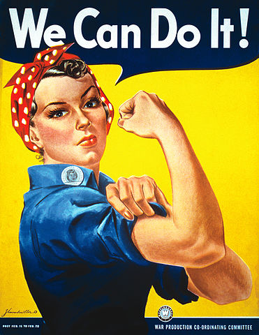
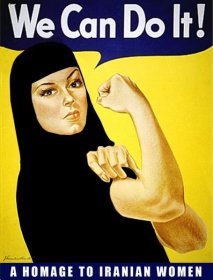
Known today as ‘Rosie the Riveter’, J Howard Miller’s famous wartime poster is often presented as an early example of ‘girl power’ marketing, with the assumption that it was officially commissioned by the American government to recruit women into the workforce. Its power and familiarity have led to countless modern parodies, more or less in support of female empowerment. In fact, the poster was designed for a private company, the Westinghouse Electric & Manufacturing Coy, and would have been viewed by a relatively small number of employees during a work incentive production drive in February 1943. As with Your Country Needs YOU and Keep Calm, its subsequent fame bears little relation to its public reception at the time of printing. Disappointingly, too, it would seem that the poster heroine acquired her name and title long after the war had ended (“Visual Rhetoric Representing Rosie the Riveter: Myth and Misconception in J. Howard Miller’s ‘We Can Do It!’ Poster,” James Kimble and Lester Olson, 2006).

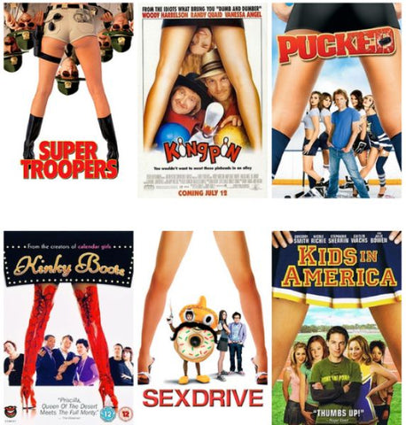
9. Legs, worldwide film industry
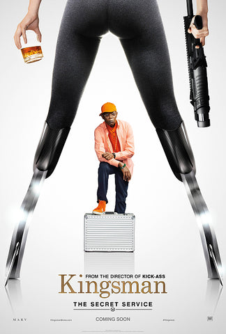
Ok, so this entry on the list is not about a specific poster but the boring, lazy, recycling of the same designs over and again by the film industry of which the headless female form is Suspect No.1. Studios pay a lot of money to target specific audiences and we can only presume that tried and tested methods provide a return on investment. But do we really need to see another group of hapless/grinning males leering through the inverted V of (often) booted female legs? Quite apart from the everyday sexism that such images promote, there must be a better way to distinguish the latest Hollywood offering from its rivals. Similarly, can an action movie only be conveyed by an explosion spurting out heavily armed heroes, or a sci-fi represented by the helmeted face of a lost astronaut? We could go on, but you get the general idea. Oh for the inventiveness and wit of a Whisky Galore (1949) or Titfield Thunderbolt (1953) film poster. And if you haven’t seen these, you really should redirect to Google Images forthwith!
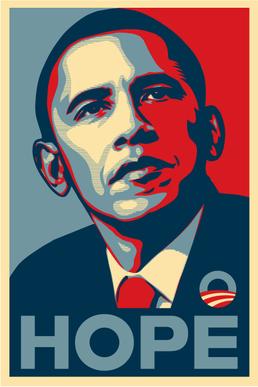
10. Hope, USA, 2008
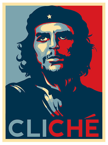
The digital age has made it all so much easier to spoof advertising campaigns without going to the trouble of getting your design printed up. Online ‘image generators’ (where a user uploads their own photo and slogan to a pre-set format) mean that even the most design illiterate among us can create impressive ‘memes’ of well-known posters. Nowhere is this more apparent than in the relentless spoofing of Shepard Fairey’s iconic Hope, originally designed to support Barrack Obama’s 2008 presidential campaign. An estimated 1 million parodies are said to have been created already, with more appearing online every day. The same phenomenon can be observed in all spheres of marketing, with the result that campaign managers are increasingly wary of the potential for damaging digital versions when commissioning new designs. In this respect, the poster parody is entering a new era of significance, where a ‘viral’ social media pastiche can have far more impact than the original paper poster.




Comments on post (1)
operaqueen says:
This is a terrific article! Someone should put it together as a show/exhibit or even an auction. The Cooper-Hewitt Museum in New York comes to mind. Can you think of anywhere else in the world. It wouyld take some time gathering the posters and putting it together. But you should pitch it and get someone to pay you to do it.
Thank you.
Leave a comment