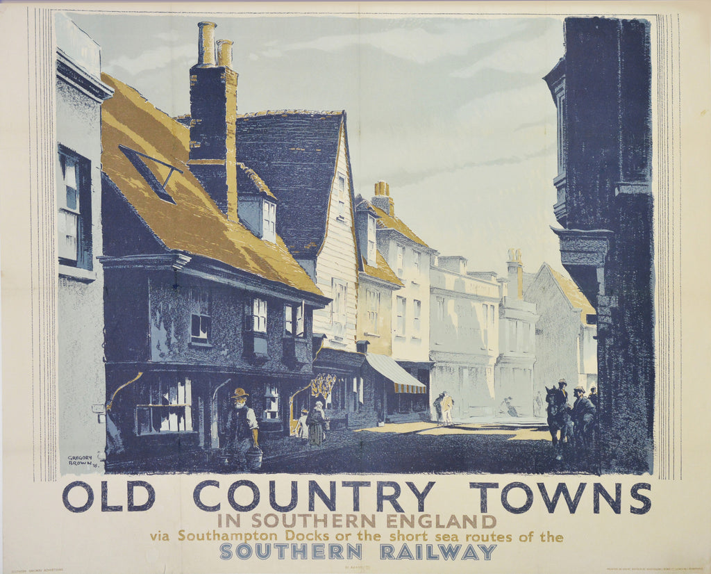
I’ve written about Gregory Brown before (A Poster Pioneer), one of my favourite commercial artists who helped inspire a generation of designers and in the process did much to improve the overall quality of pre-war advertising in Britain. This blog looks at the process behind the creation of one of his posters, Old Country Towns, published by the Southern Railway in 1939.
London Underground poster, 1916
Although he didn’t know it at the time, Old Country Towns was to be one of Brown’s final posters, printed just two years before his untimely death aged 54 in 1941. Brown had launched his career as a poster designer with London Underground during the Frist World War and by the 1930s was well established as one of the country’s leading graphic artists with a client base that included railway companies, the Empire Marketing Board and high-end retailers. He had a particularly fruitful relationship with the Southern Railway (SR), whose network served London and the south east. Under the patronage of the SR’s Public Relations Officer, Cuthbert Grasemann, Brown produced several posters extolling the virtues of Sussex, Surrey and Kent to the interwar holiday maker, and it was in this context that he was commissioned in 1938 to come up with a new design selling the ‘old world’ charm of a typical market town served by the railway.
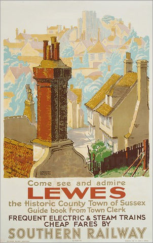
Southern Railway poster, 1930s
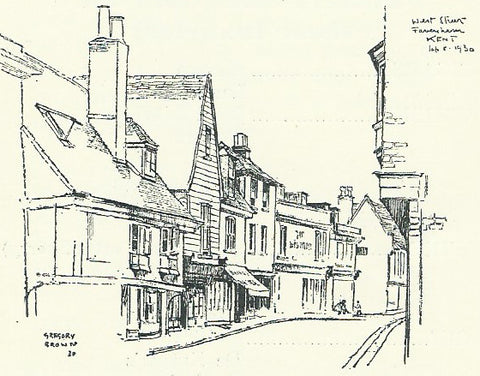
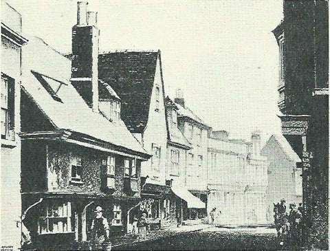
The town chosen was Faversham in Kent, less than 50 miles from London and so, presumably, a suitable location for a day trip. From an interview with the Poster magazine in July 1939 it would seem that Brown had already prepared a sketch of the town’s historic West Street during an earlier visit in September 1930 which was now presented to Grasemann for approval. This was not as unusual as it might sound, Grasemann having previously selected another of Brown’s sketches (Surrey Hills) for reproduction as a Quad Royal (50” x 40”) poster.
Original sketch of West Street, Faversham, Sept 1930
Given Grasemann’s oft stated preference for what he termed “three-dimensional representation” in poster art, his enthusiasm for Brown (a master of bold flat colour) is at first a little hard to fathom. But by the late 1930s Brown was moving away from the style that had made him famous two decades earlier. Instead he favoured a sophisticated representational approach, seen in some of his later commissions for London Transport, that chimed with Grasemann’s conviction that really first rate drawing could elicit an emotional response from the passer-by that translated directly into increased business. Moreover, both men were united in a belief that this could only be achieved through excellent draughtsmanship and superb printing, almost irrespective of the cost.
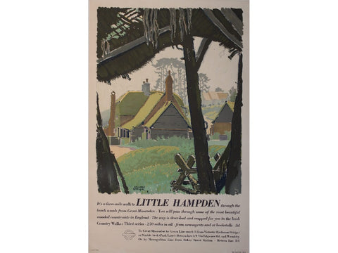
London Transport poster, 1937
This was certainly the case with Old Country Towns which went through an elaborate, and expensive, series of stages before reaching the hoardings. Following Grasemann’s initial approval, Brown returned to Faversham to paint a full colour ‘rough’ carefully noting the date and hour it was made so that shadowing could be correctly represented in the final version. Once this had been signed-off, Brown produced a finished drawing (37 1/2” x 30”) in black which was photographically enlarged to Quad Royal size and printed in one colour, in Brown’s words “to ensure an absolute facsimile of the original”. The remaining colours were then hand-applied to the one-colour print by Brown, before been sent to Waterlow & Sons for lithographic printing – itself a complex process where each colour is printed separately. “During this stage”, Brown continued, “I draw the lettering and call on the printer to see certain colours as they come off the machine to decide the right tone and strength.”
The finished black drawing
Grasemann was delighted with the result, commenting in Art & Industry (March 1940) that:
“Gregory Brown is a master of light and shade and also an excellent draughtsman. As an example, take his poster entitled Old Country Towns. In poster work it will be found that the former is almost a primary consideration, as it is light and shade that produces legibility. So far as draughtsmanship is concerned, this approach is something of a dying art, in view of the enormous use made by present-day artists of photography. Gregory, therefore, has the advantage of having been brought up to draw accurately, and yet being young enough to appreciate modern technique and modern equipment.”
Old Country Towns was printed in an edition of 2,000, almost all of which would have been posted-up at the time. Like so much of Brown’s work, the original artwork doesn’t appear to have survived, although several proof copies of the poster exist in the collection of the Victoria & Albert Museum.
Twentieth Century Posters is delighted to offer an original copy of this rare poster, full details of which can be found here.


Comments on post (1)
continuing education says:
We are a bunch of volunteers and starting a new scheme in our community. Your web site offered us with helpful information to work on. You’ve performed an impressive activity and our entire group will be grateful to you.
http://educlue.eu
Leave a comment