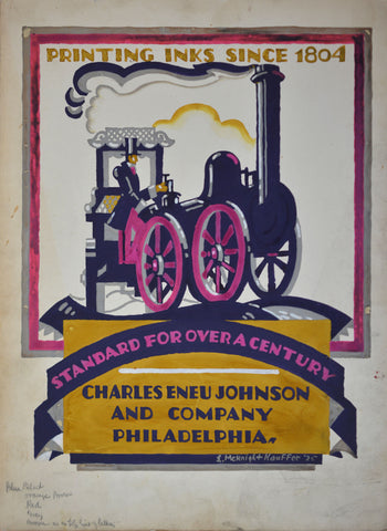
Its amazing what you can find when you're looking for something else. Last summer I was in New York searching for vintage posters, when a dealer showed me three original commercial artworks by poster legend Edward McKnight Kauffer (1890 – 1954). Executed in gouache paint, and signed/dated on the front and reverse, all three had clearly been commissioned by the Charles Eneu Johnson Printing Ink Company of Philadelphia in 1925. But what exactly they were used for and why an American ink manufacturer was hiring the London-based Kauffer for its advertising campaign remained a mystery. This set me off on the hunt for other examples from the series, some of which are shown below. Taken together, the group provides an intriguing insight into how a progressive advertiser used contemporary design for marketing effect and also reveals the unexpected transatlantic fame of Britain’s most talented poster designer.
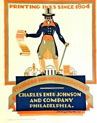
Printed version, 1925
Except, of course, that Kauffer wasn't British. He was born in Montana, USA, and moved to England during the First World War after an artistic sojourn in Paris. But like Jimi Hendrix fifty years later, Kauffer can almost be considered English by proxy due to his staggering creativity while living in London. In fact, much of Kauffer's early success was deeply rooted in his adopted homeland. His first poster commission, in 1915, was for London Underground and by the mid-twenties Kauffer was firmly established as one of the country’s leading graphic artists. His modern, innovative, designs for a wide range of clients including the Tube, Empire Marketing Board, and Eno's Fruit Salts were both well-known and well-liked. Kauffer was also admired on the continent, where his posters were frequently reviewed in the growing literature dedicated to ‘commercial art’. But he remained virtually unknown in the States, despite attempts to find work with American advertising agencies and the inclusion of some of his early posters in an exhibition at New York’s Art & Decoration Gallery in 1921.
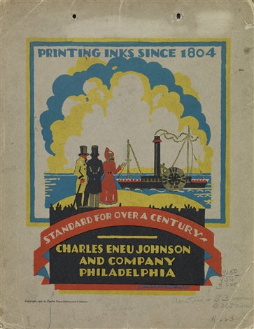
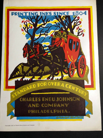
Printed versions, 1925 & 1926
Which makes his commission with the American Charles Eneu Johnson Printing Ink Company all the more surprising. Johnsons, however, appear to have taken an unusual interest in modern European graphic advertising trends and employed both Kauffer and the leading Italian poster artist Leonetto Cappiello (1875-1942) to spearhead its 1925/6 campaign. This would have been a bold choice, especially as the advertising was aimed at an essentially domestic market unfamiliar with Kauffer's style.
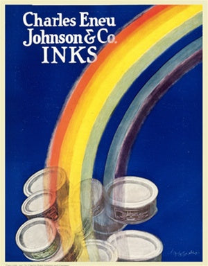
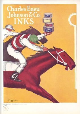
Two printed designs by Cappiello, 1925
The company had been founded in 1804 as the USA’s first industrial manufacturer of specialist printing inks. For the new campaign, both artists were asked to design adverts focusing on the vitality and colour of Johnson’s inks. Cappiello chose to achieve this through vivid, product-based, illustration, while Kauffer concentrated on the company’s historic origins and association with Philadelphia. The resulting designs were reproduced as full-page colour adverts in trade magazines, like The American Printer and Printers Ink Monthly, and as small format posters and show cards. The review journal Commercial Art was suitably impressed, writing in 1928 that the advertisements successfully highlighted ‘the special quality of the ink itself … by means of designs which in themselves create the richest and most brilliant colour values possible’.
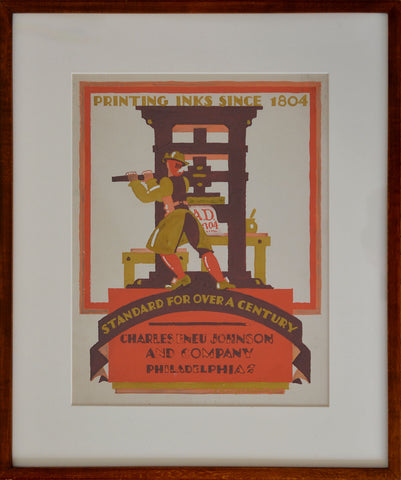
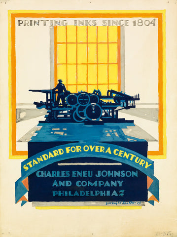
Original artwork, 1925 & 1926
Kauffer was re-commissioned to produce a follow up series in 1926, although its not known how many were published in total. So far, I’ve identified thirteen different designs from 1925 and 1926. The majority represent places, events and icons from Philadelphia history, especially the city’s important role in the Revolutionary War, such as Independence Hall, the Declaration of Independence, the Liberty Bell and a colonial soldier. Others depict pioneering American settlers, a steamboat on the Delaware River and an early steam locomotive (possibly in reference to Baldwin’s Locomotive Works – the world’s largest locomotive builder established in Philadelphia in 1825). Only three are directly connected with printing itself, one of which shows the inventor Johannes Gutenberg while the others depict printing presses from different eras.
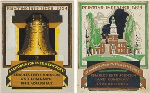
Printed versions, 1925
The original gouache designs for Kauffer’s commercial designs very rarely come onto the market, although several artworks from this delightful series have survived. Four are in the permanent collection of the Victoria & Albert Museum, London, while another is held in the Yale Centre for British Art, Connecticut.


Comments on post (0)
Leave a comment